STASH
Money Saving App

UX/UI Case Study
Objective
To help people save money quickly in preparation for a big purchase or expenditure.
Solo student project for Career Foundry UI Immersion Certificate
What is STASH?
STASH is saving simplified
Saving money can be a daunting task, especially when you have a deadline. STASH helps users saving by acting as a financial planner in their pocket. Users can easily create goals, track their expenses, and view their progress.
Problem
Experiencing pain points can easily result in mistrust from the user. That’s the last feeling users want when managing their money.
Existing applications have limitations that include:
The amount of goals users are able to create
The cards + bank accounts users are able to link to the application
Displaying inaccurate information
Solution
Create an application that users trust by providing them with a simple + intuitive product.
Goals that I have to reach that solution include:
Utilizing a simple, and appealing layout + hierarchy that makes the information easy to view and understand
Creating an application that could be used by anyone, especially those that don’t enjoy handling their finance
Allowing users to create however many goals they like
Use visual elements and grouping, that will allow users to quickly get updated on their progress
01. Discover
Competitive Analysis
I started this project by researching money-saving apps. I studied what they did well and found where I could add improvements.

Acorns
Monthly subscription fee
Takes deduction when trying to withdraw money
Incorrect information provided
Hard to transfer money

Mint
Hard to link accounts
Messy UI, made it confusing and hard to use
All of the transactions are not displayed
Users have a limit on the number of goals they are able to create
02. Define
User Stories
I was given user stories to help me define my user’s needs + develop goals that would provide them a satisfactory experience.
As a new user, I need to be able to create a profile, so that the financial advice I receive is personalized to me, my spending habits, and is tailored to my goals.
As a user, I want to see a dashboard of my finances clearly and visually, so that I can see how much I am spending on what at a glance.
As a user, I need to be able to tell the tool what my savings goal is and how long I have to reach it so that I can save accordingly.
03. Ideate
User Flows
The user stories helped me create my user flows. I simply focused on what the user needed, and created the paths to get there.

User Flow 1
As a new user, I need to be able to create a profile, so that the financial advice I receive is personalized to me, my spending habits, and tailored to my goals.
User Flow 2
As a user, I want to see a dashboard of my finances clearly and visually, so that I can see how much I am spending on what at a glance.


User Flow 3
As a user, I need to be able to tell the tool what my savings goal is and how long I have to reach it, so that I can save accordingly.
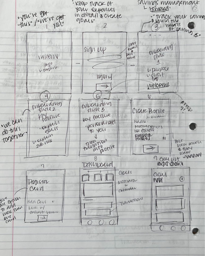
Wireframes
I created screens that corresponded with the steps users would take to achieve their goals. I focused on creating an experience that felt simple + manageable.
Then, I made an interactive prototype + integrated changes based on feedback I was given.

04. Design
A major part of this project was to create a brand. This was my first time building a brand and I was excited because it allowed me to create everything from top to bottom for this project and make decisions that could “make” or “break” the users overall experience, which proved to be my biggest challenge when completing this project.
I knew that the brands cohesion was important, and that each element successfully communicated both the purpose of the app, and the correct messaging to the users.
To help me create a cohesive brand, I chose key values that the brand would abide by.
The key values for the brand are:
trustworthiness
security
reliability
serious
builds confidence in its users
appealing to those who are less familiar with the world of finance
simplicity
clarity
Logo Design
I decided to create a logo that was entertaining + communicated the brands key values.
I recognized that my target audience consisted of users who had the desire to save money, but didn’t like working with their finances
To encourage the target audience to use the app, I wanted the app to feel entertaining
I still wanted the logo to communicate the brands’ values of providing an easy and trustworthy experience
My final logo included a cartoon-style pig with sunglasses. This was to remind users of the classic association of putting money away into a piggy bank, while the sunglasses were to represent security.

Main Logo

Secondary Logos
Colors
I decided to use a very simple color palette + chose accent colors that would further communicate the brands values.
The main colors that were used for a majority of the app are black and an off-white, to uphold the feeling of simplicity
The accent colors were chosen to communicate familiarity and trust:
Blue is a neutral color that most users enjoy
Purple is associate with wealth
Green is commonly linked with money
Black
RGB: (0,0,0)
HEX: #000000
Light Gray
RGB: (240,240,240)
HEX: #F0F0F0
Accent Color 01
Blue
RGB: (52,182,255)
HEX: #34B6FF
Accent Color 02
Accent Color 03
Purple
RGB: (143,58,248)
HEX: #8F3AF8
Green
RGB: (119,233,2)
HEX: #77E902
Fonts
I made sure to use fonts that are easy to read so the user can quickly scan the text + find what they’re looking for.
I chose this font for the headers because of the boxy shape of the letters
They have a mechanical feeling, similar to coding typefaces
This font is often associated with numbers + money

Headers
This font is simple + easy to read
This satisfies one of my users goals to quickly scan the text

Body Copy
Imagery
Even the imagery I used aligned with my brands values.

To entertain the user, I used a series of 3D cartoon hands
Each of the hands are wearing a suit jacket. Subconsciously, people are more likely to trust someone who is wearing a suit
05. Test
Preference Testing
To help me choose my final design, I asked my testers to participate in preference testing.


This was my first time building a brand when completing a project. It was fun, but evident there were things that I needed to work on.
One major challenge was the scalability of my logo.
I noticed that when I would change the size of my logo, the weight of the lines would change or the position of the name would be in a different place.
I ended up having to go back and fix any issues with my logo manually, and it ended up wasting a lot of time, especially towards the end of the project.
Another challenge I had was with aligning my brands values with my target audience.
Some of the key values included: security, reliability, and a serious tone.
My target audience included people that didn’t like managing their finances
Originally, I felt like the values clashed with the target audience, and realized I could easily turn them off to using the application altogether.
I shifted my focus to how I could successfully communicate with my target audience, and create an experience that wasn’t overwhelming for them.
I solved the issue by creating an entertaining logo, choosing colors that would energize the user, selecting fonts that were both entertaining and serious, and adding encouraging imagery.
Design on the left:
Entertaining design
The main button is an ombre, with white text
The navigation icons are colorful, labeled, and are outlined
80% of users preferred the design on the left
Challenges
Design on the right:
Serious more conservative design
The main button is a solid, with black text
The icons at the bottom are solid black with a drop shadow