Guzzlr
UX/UI Case Study

A native mobile app for iOS and Android devices that allows users to locate, search, and pay for fuel quickly and easily.
Career Foundry solo study project
May 2022
Problem
Recently gas prices have spiked, and as a result people have been searching for the cheapest gas near them.
Solution
This app allows both iPhone and Android users to view the prices of gas near their location, filter their search for personalized results, and allow them to earn rewards they can redeem for discounted gas and other rewards at select gas stations.
Competitive Analysis
I looked at existing applications in order to gather an idea of what users expect when using gas apps + what frustrated them throughout the process.
Shell
Exxon Mobile
Gas Buddy
Gas Guru
Users reported that the app displays the wrong prices
Fail to display all gas stations in the area
Users are only able to earn rewards when spending $75/day, or by upgrading to a premium membership
Displays the wrong gas prices
Recommend cheap gas prices that aren’t in the users general vicinity.
These applications do well at showing the prices of gas for a variety of stations, and allow users to filter their search by price, and grade of gas. Unfortunately, both frequently display the wrong prices.
Lo-Fidelity + Mid-Fidelity Wireframes
I focused on having users being able to achieve their goals in as few steps as possible.
First, I created user flows based on the goals that I wanted my users to achieve
To begin my wireframes, I sketched out a couple of screens that followed my user flows
I made sure to look for things that weren’t needed. I removed extra steps that would annoy the user, and elements that distracted the user
UI Design
Light Blue
HEX: #295FF6
RGB: (41,95,246)
Opacity: 12%
Green
HEX: #03A929
RGB: (3,169,41)
Light Gray
HEX: #000000
RGB: (0,0,0)
Opacity: 12%
1
Purchase gas user flow + wireframes


2
Add money to Guzzlr card user flow + wireframes


3
Receive and view rewards user flow + wireframes
To ensure I was creating a mobile application native to iOS and Android, I had to select colors and fonts that were specific to the device platform and followed their guidelines.
Color Palettes
iOS
Black
HEX: #000000
RGB: (0,0,0)
Blue
HEX: #0A84FF
RGB: (10,132,255)
Light Blue
HEX: #00B2FF
RGB: (0,0,0)
Opacity: 15%
Green
HEX: #00CC2F
RGB: (0,204,47)
Light Gray
HEX: #E5E6E7
RGB: (229,230,231)


Android
Black
HEX: #000000
RGB: (0,0,0)
Blue
HEX: #295FF6
RGB: (41,95,246)
Typography
iOS
Android

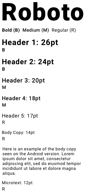
iOS
Android


Limited payment options
Includes a physical gas card
Users reported running into errors when trying to pay from their phone, so resorted to using the physical card
Users have also reported errors when trying to receive their points
Restricted to one station
Have to be close to the station to begin the process of purchasing gas
Unfortunately, users have a limited amount of options they can use to pay
Both of these mobile applications do well at showing all of their stations, and allow users to pay from their devices. These applications are limited to their stations.
Icon Sets
I used icons that were specific to their style guides
The Android icon set uses one less icon because it follows a different flow than the iOS set.
iPhone users click the QR code icon to begin paying for gas + fuel, while Android users can access the QR code on their navigation bar that’s placed on their homepage.
iOS + Android Prototypes
Instead of putting pictures of my final designs, here are the final prototypes my users interacted with. Feel free to try them out.
Challenges
Guidelines are there to help, not hinder.
Initially, I struggled with understanding that I could include my own personal touches to my design, while also adhering to the iOS and Material guidelines.
My design felt static and uninteresting, so I began to add colors, drop shadows, and ombres. Inevitably, my design became visually overwhelming.
One way I applied my colors contained blues and greens and would make it hard for colorblind users to engage with. This mistake benefitted me in the long run because it taught me about accessibility.
To solve this issue, I stripped down my design to its bare bones, then began adding details in positions that would compliment the user flows, and lead the user from start to finish.
I got rid of anything that would distract the user during the process, and deter them from their end goal.
Originally, my Android prototype only allowed users to get so far, so they weren’t able to achieve the same goals that Apple users would. I felt that this was due to my comfortability with using an iPhone rather than an Android. As I kept working on this project, I started to become for familiar with Material guidelines and UI patterns that Android users frequently use.
Key Takeaways
If I were to do this project again, I would have two separate style guides, one for the iPhone and the other for the Android. This would make it easier when including deciding which details I wanted to include in each interface, and adhere to their guidelines
I would also work on the animations that I integrated into the prototypes that I made in InVision. I’ll learn to animate using a platform that gives me more control over the animations, so I can create a design that better communicates with my testers.