Recipedia
Case Study
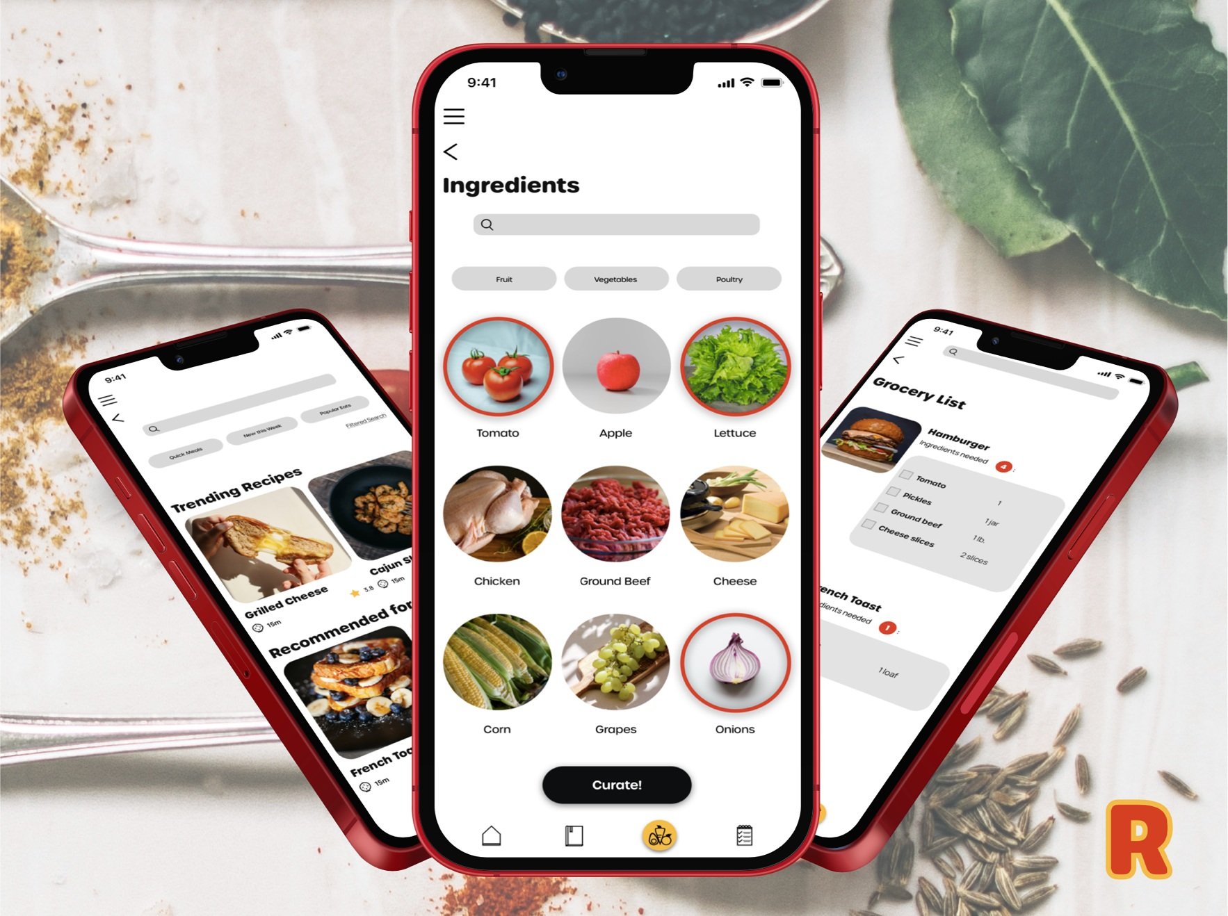
Access simple and easy to use recipes

Solo UX/UI student project for Career Foundry
Objective
To design a responsive web app for recipes that meets the needs of its users and solves problems they faced when using existing recipe applications.
Problem
Searching for a recipe online can be an overwhelming process. The recipes can require a lot of time, money, and cooking experience.
Solution
Design a responsive web application that allows users to curate recipes based on the ingredients that they have with simple step-by-step instructions that anyone can follow.
01. Research
To help me begin this project, I identified common patterns that users expect when navigating recipe applications + pain points they experience.
Competitive Analysis
I found common patterns and key functionalities that users wanted and needed from a recipe app was by completing a user analysis.
Identifying what they did successfully was helpful, but the most important information was found when shifting my focus to pain points.
Pain points helped me find gaps that I worked to fill when creating my application.

Kitchen Stories
Inconsistencies in recipes - users end up buying ingredients they don’t need
Add filters on search page without having to click “all recipes”
Hard for users to upload recipes

Forks Over Knives
In order to add any customizations, have to purchase the app to get the full experience
Users are frustrated with the free and purchased recipes offered and advice that others find them elsewhere

My New Roots
Use large blocks of text that are hard to read, more appropriate for a blog or magazine
Hard to distinguish between the recipe and the article
Light grey color used for navigation is hard to read
App doesn’t work
User Personas
I gathered more feedback by interviewing users who frequently use recipe apps. The competitive analysis + interviews helped me create my user personas.

User personas helped me focus strictly on my target audience, and what they would need when using my application.


02. Ideation
To begin ideating, I focused on the functionalities I wanted to integrate, and started sketching my wireframes.
Lo-Fidelity Wireframes
I tried various layouts, to find the most cohesive way to organize everything the user needed.


Mid-Fidelity Wireframes
Then, I made a mid-fidelity prototype my participants could interact with. This helped me establish what was going well with my design + what could be better.
I added details to my lo-fidelity wireframes, drew them digitally on my iPad, and created an interactive prototype on InVision that I sent out to my users for usability testing.


03. Design
I focused what individuals typically associate psychologically with various colors, fonts, and imagery. This consideration helped me communicate the correct message to my target audience.
Color
The main colors that I used in my design are bold and lively colors. I used red and yellow because they are associated with food and hunger.
Ash
Mustard
HEX: #D8D8D8
HEX: #F3BC43
Ketchup
Charcoal
HEX: #D54022
HEX: #000000
Typography
I used a bubbly, entertaining typeface for the headers, and for the main text, I used a plain sans serif font to give the design a simplistic feel and to make the text easy to read.

Headers
Body Copy
Icon Set
I wanted to make sure that the icons I used emulated an entertaining feel to match the rest of the application, so I created a set unique to my design.
Testing
I ran a preference test to help me choose my final design. This helped me create a product that users actually wanted to use. The results showed that the testers preferred the design on the left.

Hiccups + Roadblocks
One of my goals was for users to be able to utilize my app easily on their mobile phones, tablets, or computers. So I needed my design to look visually appealing on each of the devices.
There were minor hiccups here and there, but I hit a major roadblock and struggled when creating my responsive screens.
I had trouble determining the breakpoints that would look best with my design. Initially, my design look warped or I noticed the spacing was off as I stretched the screens.
Having the proper layout and grid helped me determine the size of my screen that wouldn’t alter my design, and would look pleasant when the app was used on a tablet or laptop.


Responsive screens allow the user to access the application on their mobile device, tablet, or laptop.